Home Paint Color Ideas to Revitalize Your Space
Color is one of the most powerful tools in interior design. It influences mood, perception, and even energy levels within a home. When thoughtfully selected and applied, paint can transform tired, outdated rooms into vibrant, welcoming spaces. Whether you’re preparing to refresh a single wall or revamp your entire home, the right home paint color ideas can inspire a complete aesthetic shift. In this article, we’ll explore trending and timeless color palettes, how to match them with your interior style, and practical tips for choosing colors that align with both your personality and purpose.
Understanding the Role of Color in Interior Design
Color does more than decorate a wall—it establishes the emotional tone of a room. Cool tones like blues and greens can promote relaxation and calm, making them ideal for bedrooms and bathrooms. Warm hues such as reds, oranges, and yellows are known to energize and stimulate, which is why they work well in social or creative areas like dining rooms and kitchens.
Neutral tones—grays, beiges, and whites—offer versatility and sophistication. These shades act as foundational colors that allow furniture, art, and accent décor to shine. Additionally, the use of bold colors, such as navy, emerald green, or even black, is becoming more mainstream, adding depth and contrast to modern interiors.
The key to selecting a great paint color lies in understanding the function of the room and the mood you want to create. This is where psychology, lighting, and the orientation of the space all play vital roles.
Popular Paint Color Trends and Their Applications
Soft Earth Tones and Organic Neutrals
One of the most noticeable shifts in interior paint trends is the movement toward nature-inspired colors. Soft browns, olive greens, clay reds, and muted yellows mimic the earthy palette found outdoors, creating a warm and grounding atmosphere. These tones are perfect for living rooms, studies, or any space where comfort and connection to nature are desired.
Pairing these colors with natural textures such as wood, stone, or linen further enhances the organic feel. An olive green accent wall, for example, works beautifully against a backdrop of wooden furniture and beige upholstery, bringing a calming rustic charm into the home.
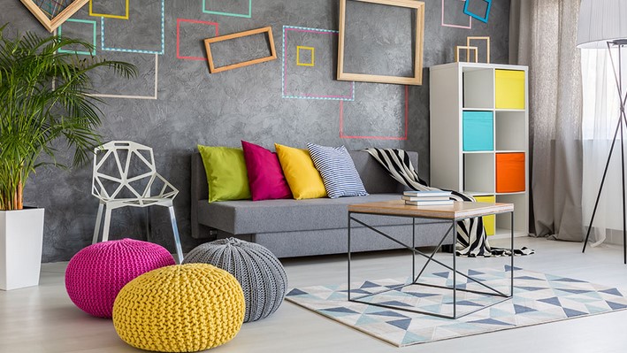
Bold and Saturated Accent Colors
For those who prefer a more expressive approach, bold colors are making a big comeback. Deep navy, charcoal black, rich burgundy, and even vibrant mustard are being used as accent walls or on statement furniture. These saturated hues offer drama and sophistication, especially when paired with metallic finishes like gold or brass.
Accent colors can be particularly impactful in areas like entryways, powder rooms, or reading nooks, where a strong design statement can leave a lasting impression. The key to using bold colors successfully is balance—complement the intensity with neutral elements to avoid overwhelming the space.
Soothing Pastels and Coastal Blues
Pastel colors are regaining popularity due to their soft, inviting nature. Light pinks, mint greens, lavender, and powder blues create a light and airy ambiance that works well in small rooms or areas that lack natural light. Coastal blue tones, in particular, evoke serenity and freshness, making them ideal for bathrooms, kitchens, or beach-style interiors.
These soft tones work beautifully with white trim, natural fibers, and simple furniture, giving rooms a relaxed yet refined look. They are especially useful for creating spaces that promote wellness, mindfulness, and calm.
Practical Tips for Choosing and Applying Paint Colors
Consider Lighting and Room Orientation
Natural and artificial lighting can significantly alter how a paint color appears. South-facing rooms tend to receive warmer light, enhancing warm tones, while north-facing rooms have cooler, bluish light that may dull warmer hues. Test paint samples on different walls and observe them throughout the day to see how light affects the appearance.
It’s also wise to use samples rather than making decisions based on small color chips. Painting a section of the wall or using large peel-and-stick swatches can give you a much clearer idea of how the color will behave in the room’s unique conditions.
Harmonize with Existing Elements
When choosing paint colors, consider the fixed elements in your home—flooring, cabinetry, countertops, and large furniture pieces. Your wall color should either complement or contrast these features in a harmonious way. For instance, warm-toned wood floors may pair better with earthy or warm-toned walls, while sleek gray tiles might suit cooler shades like icy blues or soft charcoal.
Using a color wheel can help in choosing complementary or analogous color schemes that work well together and create visual cohesion throughout your space.
Don’t Overlook the Ceiling and Trim
While walls typically take center stage, ceilings and trim offer subtle opportunities for creativity. A ceiling painted a shade lighter or darker than the walls can add dimension to the space. Trim painted in a crisp white or bold contrasting color can define architectural details and add polish to the room.
Gloss levels also matter—matte finishes hide imperfections and offer a soft look, while eggshell or satin finishes add a bit of sheen and are easier to clean. Glossy finishes are best reserved for trim and cabinetry.
Refreshing your home doesn’t always require a complete renovation—sometimes, all it takes is a thoughtful approach to color. With the right home paint color ideas, you can revitalize your space, enhance your mood, and reflect your personal style in every room. Whether you choose soft earth tones for warmth, bold accents for drama, or serene pastels for tranquility, paint offers an affordable and transformative solution. By understanding the impact of color, lighting, and design harmony, your home paint color ideas can evolve from inspiration to beautiful reality.

